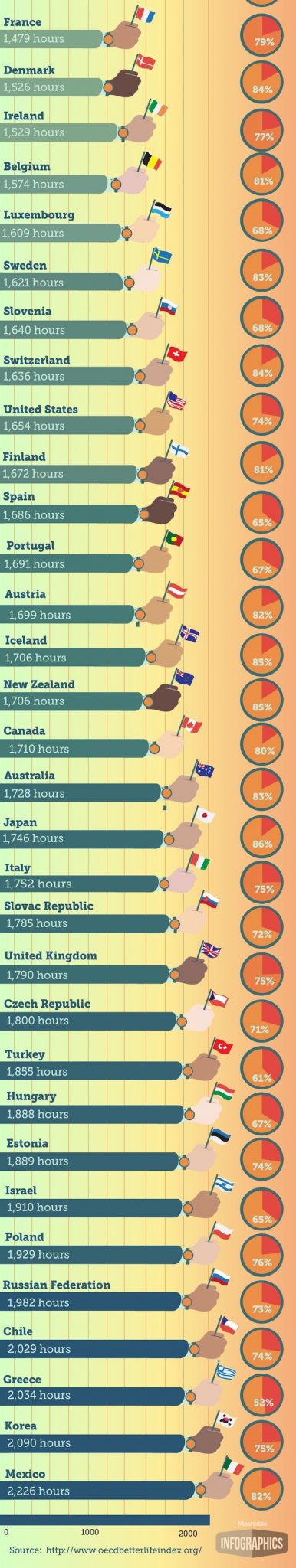
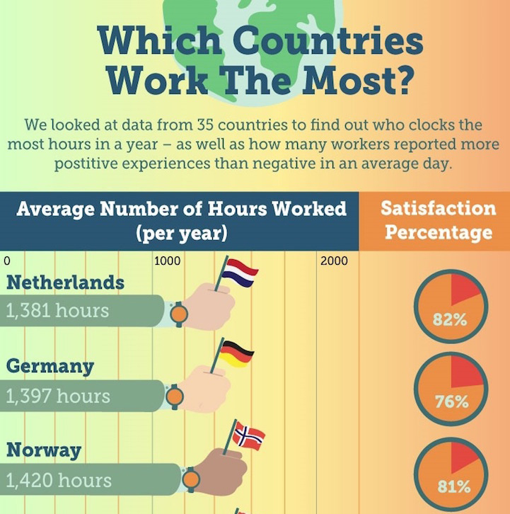
Based on data from the Organization for Economic Co-operation and Development (OECD)’s Better Life Index, Vicky Leta made this eye-opening infographic that shows “Average number of hours people working per year” VS “Percentage of satisfaction to their profession” in different countries.
Work should be an element of our life, remember that we work to live, not live to work. Do you work to live or live to work?
Related posts:
Stunning body art mixing body painting and optical illusions
Stunning digital illustration called "Living Sketch"
Sleeping under the stars and enjoying the beauty of snow mountains
We can pretend to have read these classic novels after watching funny illustrations below
When iconic faces of classical art appearing in modern city
Funny advertising campaign - Love him like you love yourself
Strange body painting illusions by Japanese artist Chooo-san
Illustrations showing the world where animals were the dominant species
Delicious sushi art
Collection of best 20 photos of National Geographic 2015 - Photo of the Day: Your Favorites From 201...
40 funny party bets you will win all the times
Minimalist tattoos by Bicem Sinik
Humorous photo juxtapositions by Stephen McMennamy
Birds with dog heads or dogs with bird bodies
Illustrators' responses to Donald Trump's presidency
0 Comments